
I have been working on several ideas for the book cover project. This will, I think be the final version. The story is about a boy who lives in a whispering house and he is haunted by an obsession to get money for his mother. He does this by riding his rocking horse until he is told the winner of the next big horse race, with his uncle's help they then place bets, and win. Needless to say it costs him his life. I wanted to convey the whispering house and the idea of the boy being haunted by the horses.
Monday, 30 January 2012


Friday, 27 January 2012
cupcakes and photoshop
My kids are having a cake sale at school today. They are raising money to buy sand for the new sand pit. And I have finally got my desktop up and running so I have photoshop again. So happy days all round!

Tuesday, 24 January 2012
mini empire
 |
| Mini Empire as seen by Anna G |
Sunday, 15 January 2012

pots

I managed to have an afternoon of drawing at Brook Street Pottery on Saturday. I am working on roughs in different styles. Hopefully these will lead to some prints and perhaps even a show.
Friday, 13 January 2012
creepy house
Does it say "creepy" to you? Or more accurately "1920s" and "a bit odd"? Does it say anything?

horse(ish)
Trying to get whispering, smoklike, tendrils to say "horse" turns out to be harder than you would hope. Click on the picture to go to my flickr and see just how hard!!!!

Wednesday, 11 January 2012
cup of tea

You can find more photos of the drawings if you click on the picture above and go to my Flickr account.


Wednesday, 4 January 2012
popsop, yin and yang, and speciality farm foods
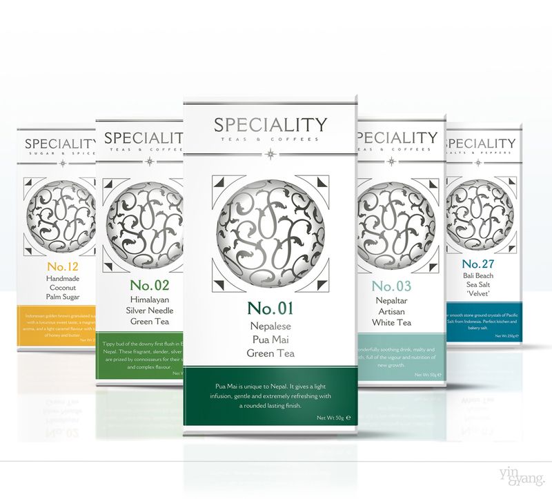
I have found a really useful website - popsop. An online brand magazine containing lots of useful information and articles about design and branding.
Of particular interest was the above packaging designed for Speciality Farm Foods by Yin and Yang design agency (I am having trouble finding a link to them). According to packaging news "Yin & Yang was given a blank canvas to create the range. It has used calligraphy and a monochrome palette splashed with colour accents to distinguish the products. The agency has now assumed a strategic and creative overview role with the brand."
Given that the product was for Harrods, the Daylesford Organic chain and online, the customer/target audience will be similar to the one we are dealing with in our brief.
As reported in popsop Lisa Goodwin, co-founder of Yin and Yang says: “We have designed the brand identity and packaging to convey luxury and quality so that people understand at a glance what the range is all about.” Again this is what we are aiming for with our brief.
blend-it and trinidad chocolate

Subscribe to:
Posts (Atom)